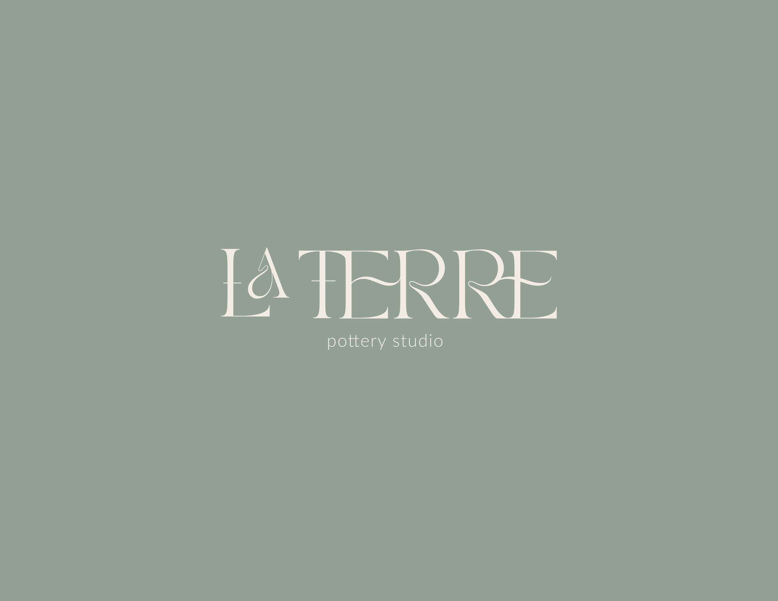
la terre.
about the project
pottery studio
earthy, warm, elevated
branding
industry:
personality:
objective:
Interested in purchasing this branding?
Click here to send me a message!
services
-
selecting overall tone, design and color palette that reflects an elevated pottery studio experience to reach the target audience.
-
I wanted to create a logo that warm and earthy, yet elevated.
The curves in this display font reminded me of the organic curved lines you find in pottery.
I drew the inspiration for the color palette from the sand, clay and succulents you find the in dessert.
-
For this studio, I wanted to create stickers, branded tissue paper and a thank you card that the studio could use for to provide customers with when they picked up the finished pottery.


Interested in purchasing this branding or
want to work together to create your custom branding?
disclaimer: this project was created for a fictional company based on a brand brief from the glow & grow club